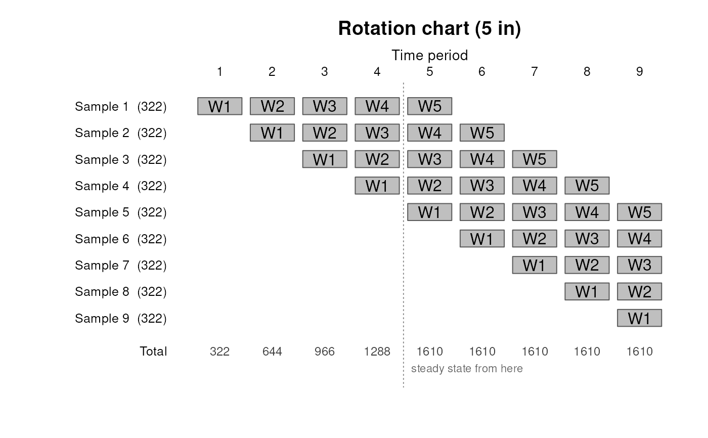
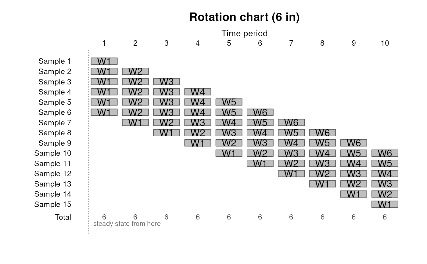
Draw the rotation chart of a design_overlap() schedule, one row per
cohort and one column per time period, with a labelled cell wherever
that cohort is in sample. This is the figure rotation designs are published as,
and it is the fastest way to see that a schedule is the one you meant.
Arguments
- x
A
svyplan_overlapobject fromdesign_overlap().- type
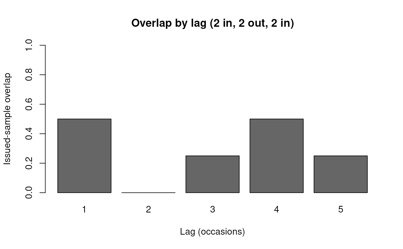
"schedule"(default) for the rotation chart,"overlap"for a bar chart of the overlap at each lag, which is whatprint()reports as a table.- start
The launch to draw.
"gradual"recruits one cohort per period, so the design fills up over a life."immediate"adds, at the first period, one launch panel for every possible remaining life length. All panels begin at their first interview, so the design is full at once.design_overlap()gives the same mature overlap profile under either launch, although realized overlap is higher early in a gradual launch. Defaults to the launchpanelwas planned with, or to"gradual"when there is none. Available for a life without a break in it, for the reasonn_panel()'s ownstartgives.- n_period
Time periods to draw, with a cohort entering at each one. Defaults to the life plus four, which reaches the steady state and shows several periods of it.
- panel
Optional
n_panel()result withdesign = "rotating", whosen_entrantsscales the sample labels and the total row from cohort shares to units. Its cohort count must match the schedule's life.- ...
Additional graphical parameters.
mainandcolare honored by both types,colbeing the cell fill for the chart and the bar fill for the profile. The profile passes the rest tobarplot().
Details
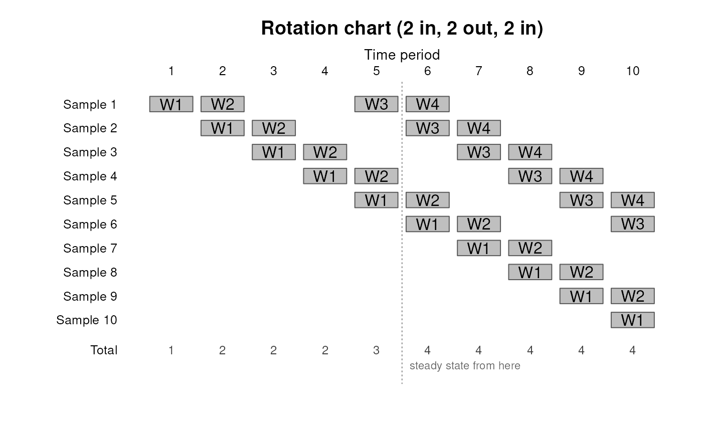
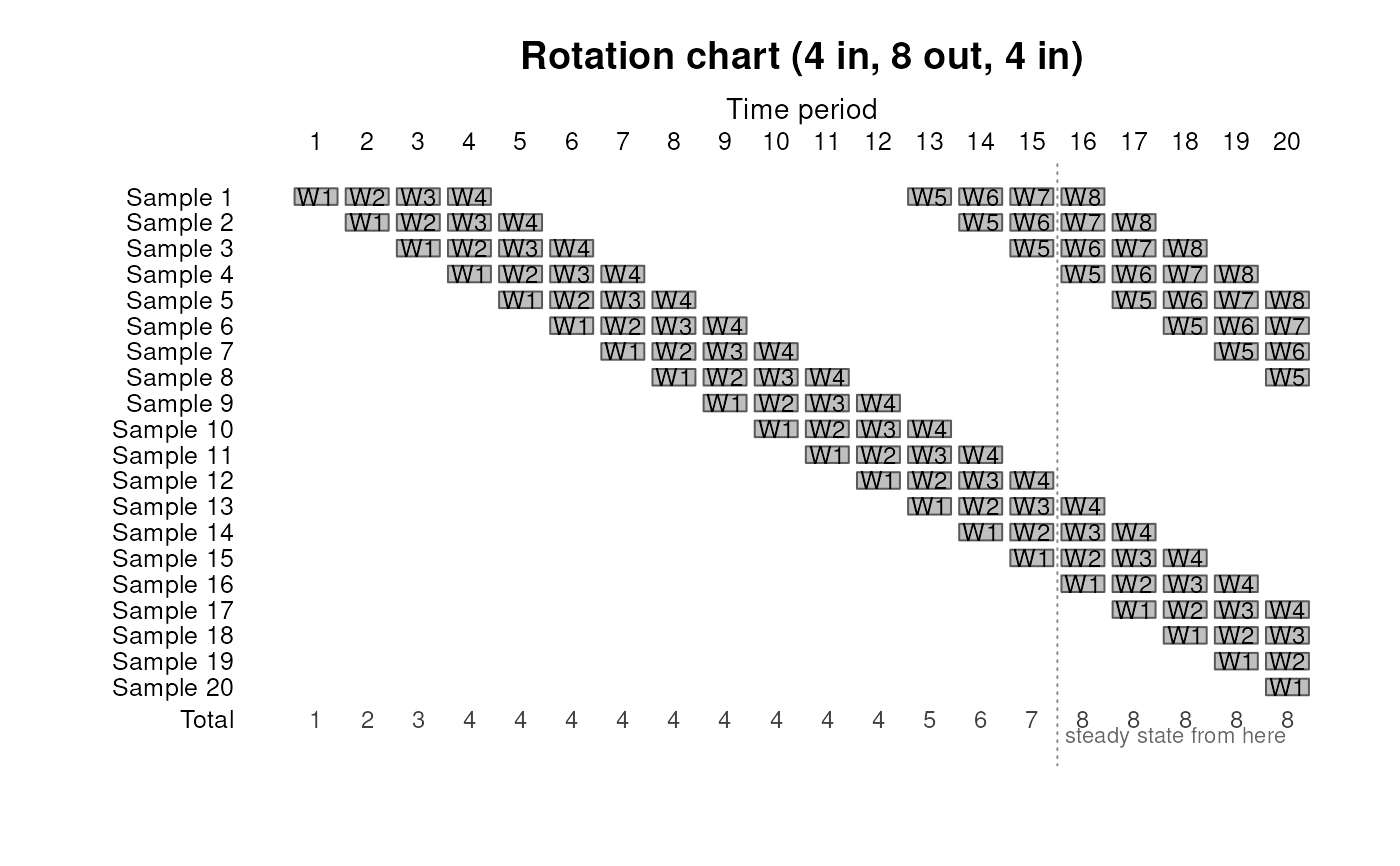
Each row is a cohort with an entry period, and its cell at period \(t\) is the stage of its life that period reaches, drawn when the schedule puts that stage in sample. Cells are labelled by wave, counting only the occasions in sample, so a schedule with a gap numbers its waves consecutively across the gap, and a cohort launched part-way through a life still starts at W1, its waves being counted from its own first interview.
The chart is one launch, and the overlap is a steady state. Drawing
one cohort entering per period leaves the early periods short of cohorts:
the total row climbs until every stage of the life is represented, which
happens at the period marked on the axis, and the overlaps
design_overlap() reports describe the design from that period on.
That gradual start is a design decision rather than the only one, and
start draws either. "immediate" splits the first period into panels
planned for remaining life lengths from the full life down to one period.
Every panel begins at its first interview, so the design holds its whole
sample at once and the marked period is the first. design_overlap() gives
the mature overlap profile under either launch. Before a gradual launch
reaches the marked period, its realized overlap is higher because no full
set of cohorts has yet rotated through. n_panel() reports the response
and precision path while either launch settles.
An immediate launch is drawn for a life without a break in it, for the
reason n_panel()'s own start gives. When panel is supplied and
start is not, the chart draws the launch that panel was planned with,
rather than defaulting past it.
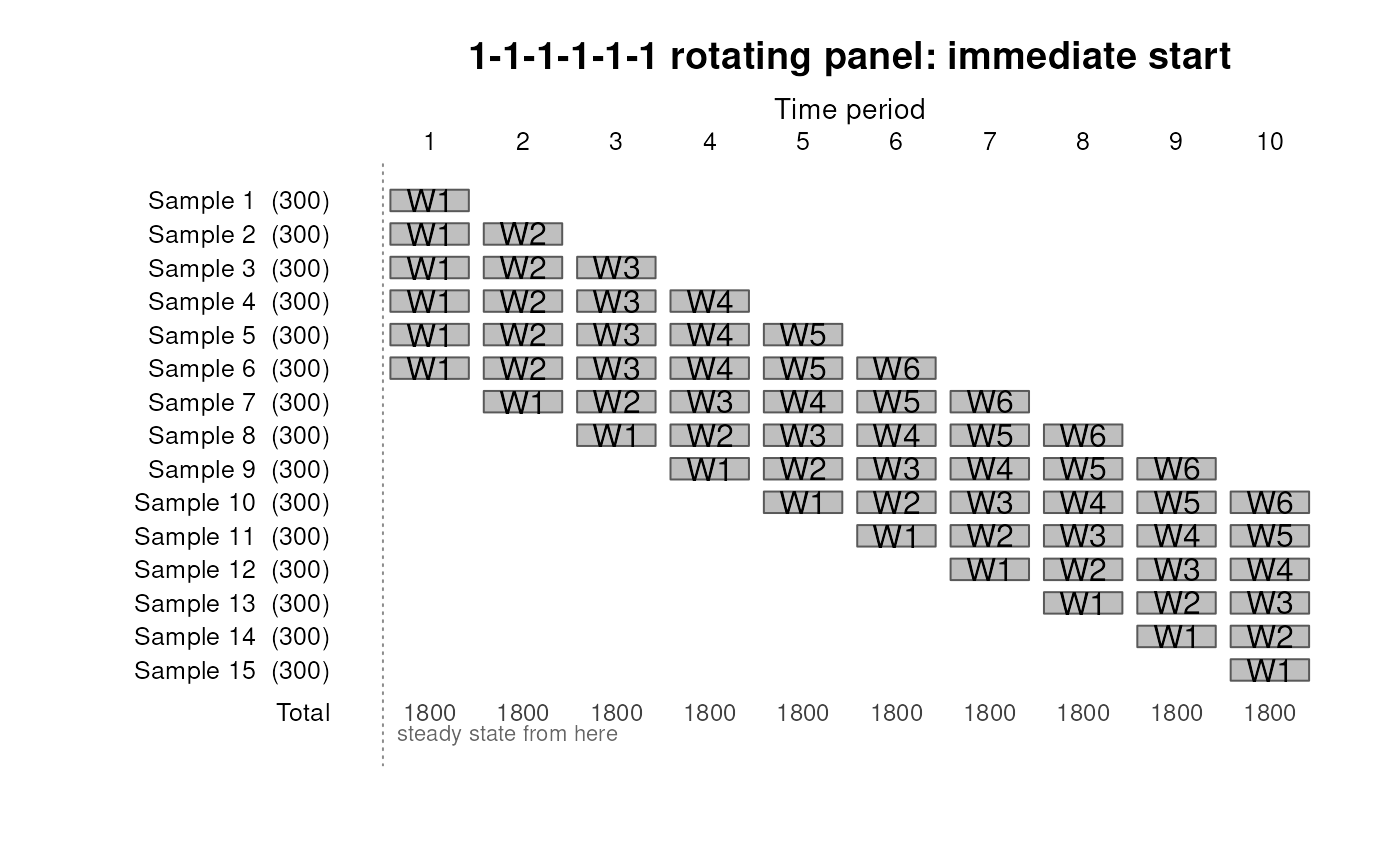
Lynn's printed Figure 5 labels Samples 1 through 10 only. Its total row of 1,800 through period 10 nevertheless assumes that a new 300-unit sample continues to enter in periods 6 through 10. This chart draws those implicit Samples 11 through 15 as well, so every displayed total is supported by the cohort rows above it.
A take that varies over the life shades its cell in proportion, so a schedule that subsamples later waves is visible as it is drawn.
References
Lynn, P. (2012). Longitudinal Survey Methods for the Household Finance and Consumption Survey. Report to the European Central Bank. Figures 2 to 5 are charts of this kind.
See also
design_overlap() for the schedule and the overlaps it produces,
and n_panel() for the recruitment that fills it.
Examples
# Two occasions in, two out, two in
plot(design_overlap("1-1-0-0-1-1"))
 # The overlap the chart produces, at each lag
plot(design_overlap("1-1-0-0-1-1"), type = "overlap")
# The overlap the chart produces, at each lag
plot(design_overlap("1-1-0-0-1-1"), type = "overlap")
 # CPS 4-8-4, one row per monthly cohort
plot(design_overlap("4-8-4"))
# CPS 4-8-4, one row per monthly cohort
plot(design_overlap("4-8-4"))
 # The same mature design brought up at once instead, full from period 1
plot(design_overlap("6"), start = "immediate")
# The same mature design brought up at once instead, full from period 1
plot(design_overlap("6"), start = "immediate")
 # Lynn Figure 5: six 300-unit launch samples, then 300 new units per period
lynn_target <- prec_prop(n = 1800, p = 0.5)
lynn_panel <- prec_panel(
300, target = lynn_target, retention = rep(1, 5),
design = "rotating", start = "immediate"
)
plot(design_overlap("6"), panel = lynn_panel, n_period = 10,
main = "1-1-1-1-1-1 rotating panel: immediate start")
# Lynn Figure 5: six 300-unit launch samples, then 300 new units per period
lynn_target <- prec_prop(n = 1800, p = 0.5)
lynn_panel <- prec_panel(
300, target = lynn_target, retention = rep(1, 5),
design = "rotating", start = "immediate"
)
plot(design_overlap("6"), panel = lynn_panel, n_period = 10,
main = "1-1-1-1-1-1 rotating panel: immediate start")
 # Labelled in units rather than cohort shares
target <- n_prop(p = 0.5, moe = 0.031)
rot <- n_panel(target, retention = c(0.878, 0.963, 0.936, 0.956),
resp_rate = 0.728, design = "rotating")
plot(design_overlap("5"), panel = rot)
# Labelled in units rather than cohort shares
target <- n_prop(p = 0.5, moe = 0.031)
rot <- n_panel(target, retention = c(0.878, 0.963, 0.936, 0.956),
resp_rate = 0.728, design = "rotating")
plot(design_overlap("5"), panel = rot)