Visualize sampling fractions per stratum or power curves from svyplan results.
Details
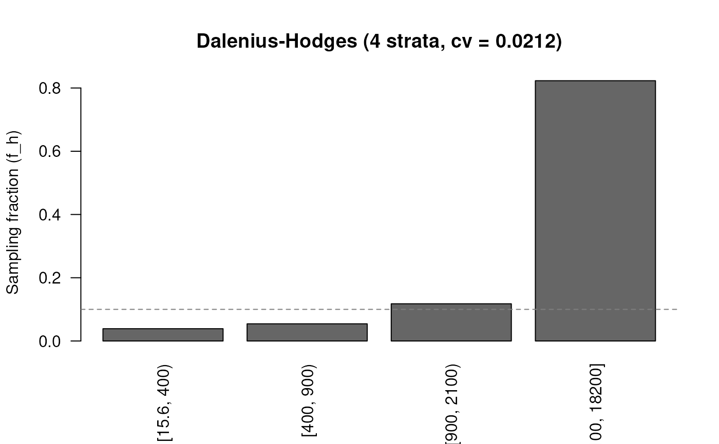
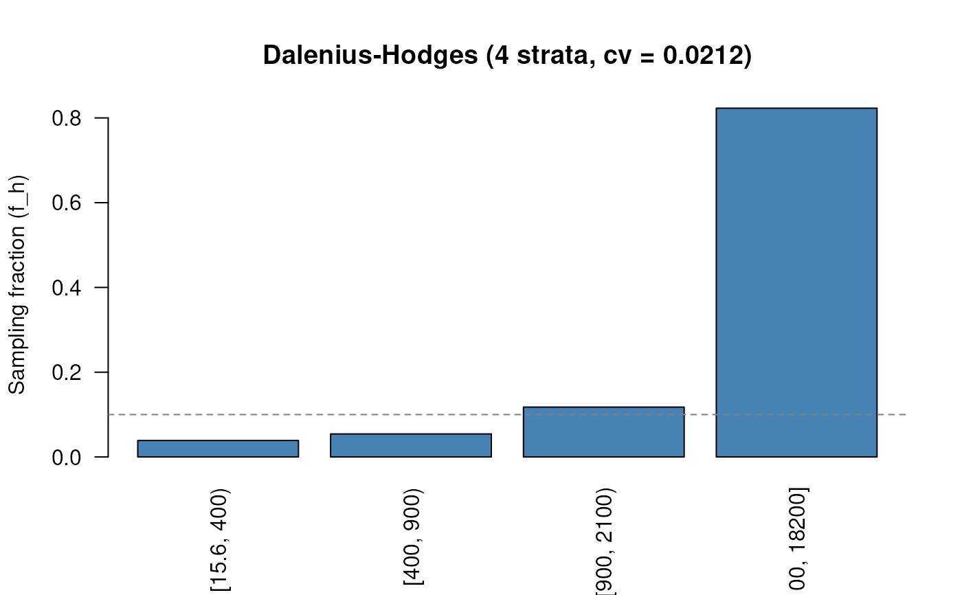
plot.svyplan_strata() draws a bar chart of per-stratum sampling
fractions (f = n / N) using barplot(). This shows how
intensively each stratum is sampled, under Neyman allocation,
high-variance strata get higher fractions. A dashed horizontal line
marks the overall sampling fraction (n / N). Defaults:
col = "grey40", ylab = "Sampling fraction (f)", las = 2.
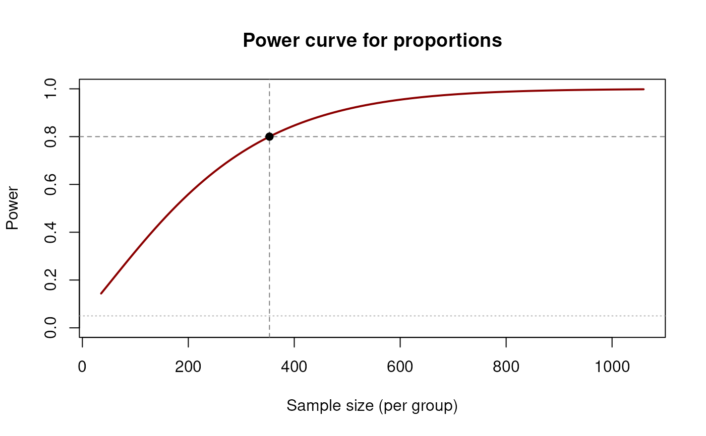
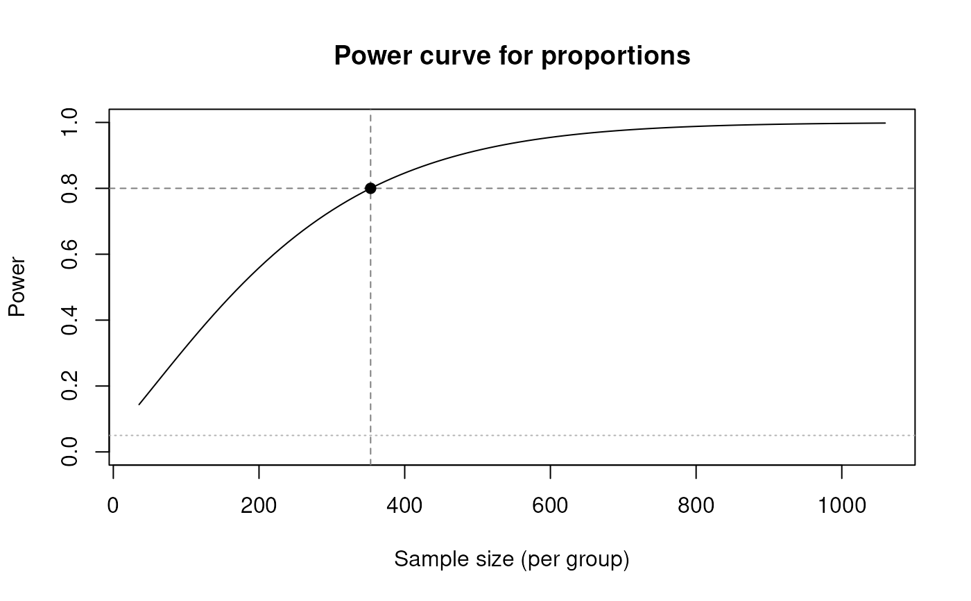
plot.svyplan_power() draws the power-vs-sample-size curve using
plot(). The solved point is shown as a filled dot, with dashed
reference lines at the computed power and sample size, and a dotted
line at the significance level. Defaults: ylim = c(0, 1),
type = "l", xlab = "Sample size (per group)", ylab = "Power".
Examples
# Sampling fraction per stratum
set.seed(1907)
sb <- strata_bound(rlnorm(2000, 6, 1), n_strata = 4, n = 200,
method = "cumrootf")
plot(sb)
 # Custom colour
plot(sb, col = "steelblue")
# Custom colour
plot(sb, col = "steelblue")
 # Power curve with defaults
pw <- power_prop(p1 = 0.30, p2 = 0.40, power = 0.80)
plot(pw)
# Power curve with defaults
pw <- power_prop(p1 = 0.30, p2 = 0.40, power = 0.80)
plot(pw)
 # Custom line width and colour
plot(pw, lwd = 2, col = "darkred")
# Custom line width and colour
plot(pw, lwd = 2, col = "darkred")